

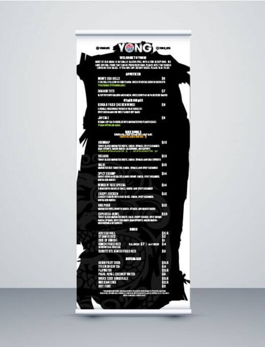
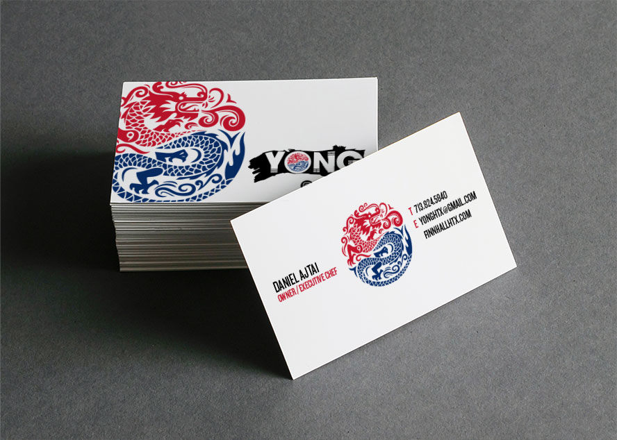
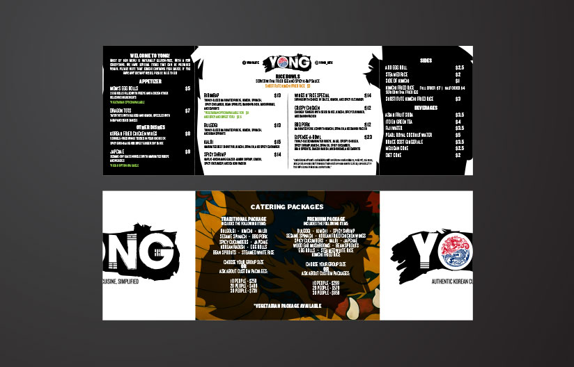
I described to Mike at Light Sketch Creative the kind of logo I was imagining for my company, and he came up with multiple different renderings. Light Sketch Creative has developed our complete brand: logo, business cards, stickers, magnets, menus, banners, pop-up menus, information cards, and more. Light Sketch Creative has provided indispensable guidance to help me grow my company. Customers are blown away by our graphic design, and we are always putting people in touch with Light Sketch Creative who are looking for cutting-edge design work.
DANIEL AJTAI
CHEF / OWNER OF YONG
YONG CASE STUDY
BRANDING AND DESIGN SERVICES
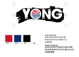
Brand StrategyCorporate ID / LogoBusiness cardsSignage DesignMenu DesignSticker, Patches, MagnetsAnd FlyersTo Go & Catering Menu DesignPhotography
THE STORY
Daniel Ajtai chef-owner of YONG, an authentic Korean restaurant concept, came to us to create his visual brand strategy that encompasses YONG’s approach to authentic Korean dishes and flavors while giving diners a multitude of Korean sides in a simplified fast dining experience.
We dove into Korean traditions, color palettes, symbolism, and delicious food. Yong means “Dragon” in Korean and is also Chef Ajtai’s mother’s maiden name. The symbol of the dragon is very important to Chef Ajtai and his brand. We made sure to follow all specifics to Korean dragons and Korean symbolism we learned in the discovery process. Chef Ajtai was pertinent in the entire process of working together. We were able to collaborate and agree on numerous ideas. Our seamless collaboration helped us to create an amazing solution and brand identity that Chef Ajtai is extremely excited to market and champion his brand with.

Brand Strategy, Brand Identity, Brand Cohesion, Brand Seen Everywhere!
Schedule a free strategy call now!