
Visual systems built for growth.
A cross-section of branding, identity, packaging and web projects. Every case study is a partnership, no template rebrands.
These are full brand systems, not logo reveals. Each case study shows how one identity is carried across everything a customer actually touches: packaging, signage, print collateral, campaigns, apparel and the website. That is usually where brands come apart, and where the work pays off. If you want to see the underlying services, start with brand strategy, brand identity, graphic design or website design.
Prefer to browse the visuals? See the full portfolio gallery of logo systems, packaging, campaigns, collateral and websites.
Restaurant & Hospitality
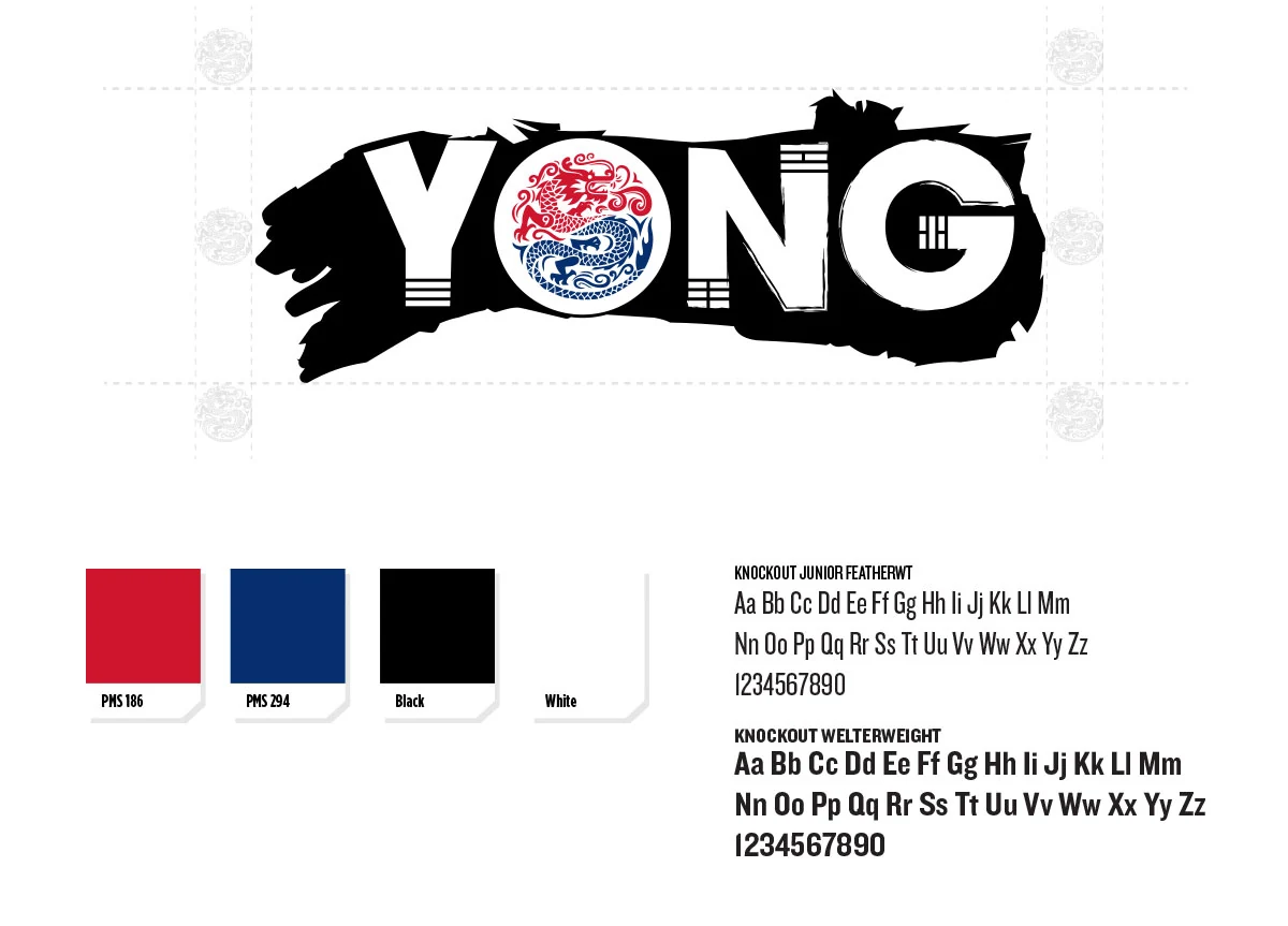
YONG
A bold, dragon-led identity for a Korean fast-casual concept inside Finn Hall food hall in downtown Houston.
- Opened to full-capacity traffic in Finn Hall with the highest brand recall of any stall in the hall
- Online ordering and delivery channels launched day one, adding a second revenue stream beyond walk-up
- Catering inquiries generated directly from the new print and banner system
Travel & Hospitality
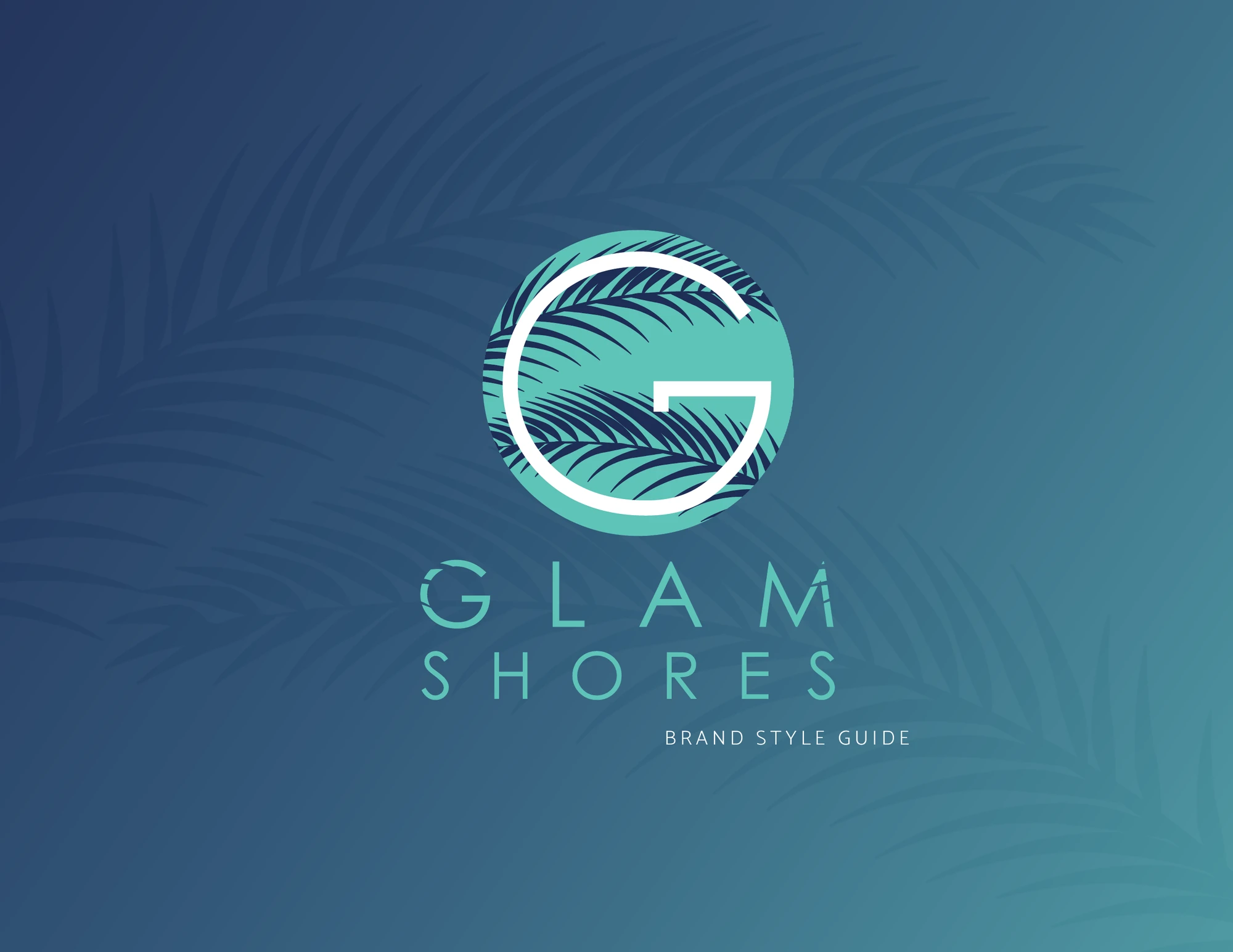
Glam Shores
Naming, identity, brand voice and website for a women-only luxury travel agency curating exclusive beach and resort getaways.
- Launched a bookable brand from zero, name, identity and website, in a single engagement
- Premium positioning supported higher-ticket curated trip pricing from day one
- Consistent social and email kit reduced content production time for every campaign
Retail & Seasonal Events
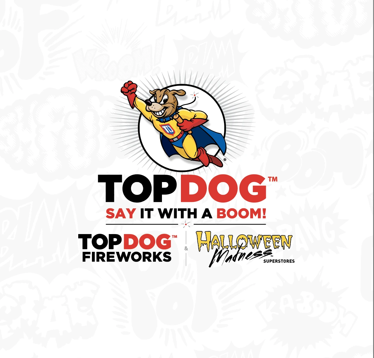
TopDog Fireworks & Halloween Madness
A full rebrand and campaign system for a 14-store Houston fireworks and Halloween retailer, tied to a 30% sales lift in year one.
- Sales grew 30% in the first year after the rebrand
- Social and website traffic grew 50%
- Landed sponsorships with the Houston Dynamo, Texas Renaissance Festival and Houston Zombie Walk
Healthcare
Mountain View Regional Hospital
A full rebrand and multi-channel ad campaign that gave a physician-owned Wyoming hospital a recognizable, ownable brandstory across every patient touchpoint.
- Community-wide campaign visibility across billboards, arena ice and print
- Physician recruitment campaign gave HR a repeatable, on-brand hiring asset
- Patient guest guide system replaced ad-hoc handouts and reduced reprint costs
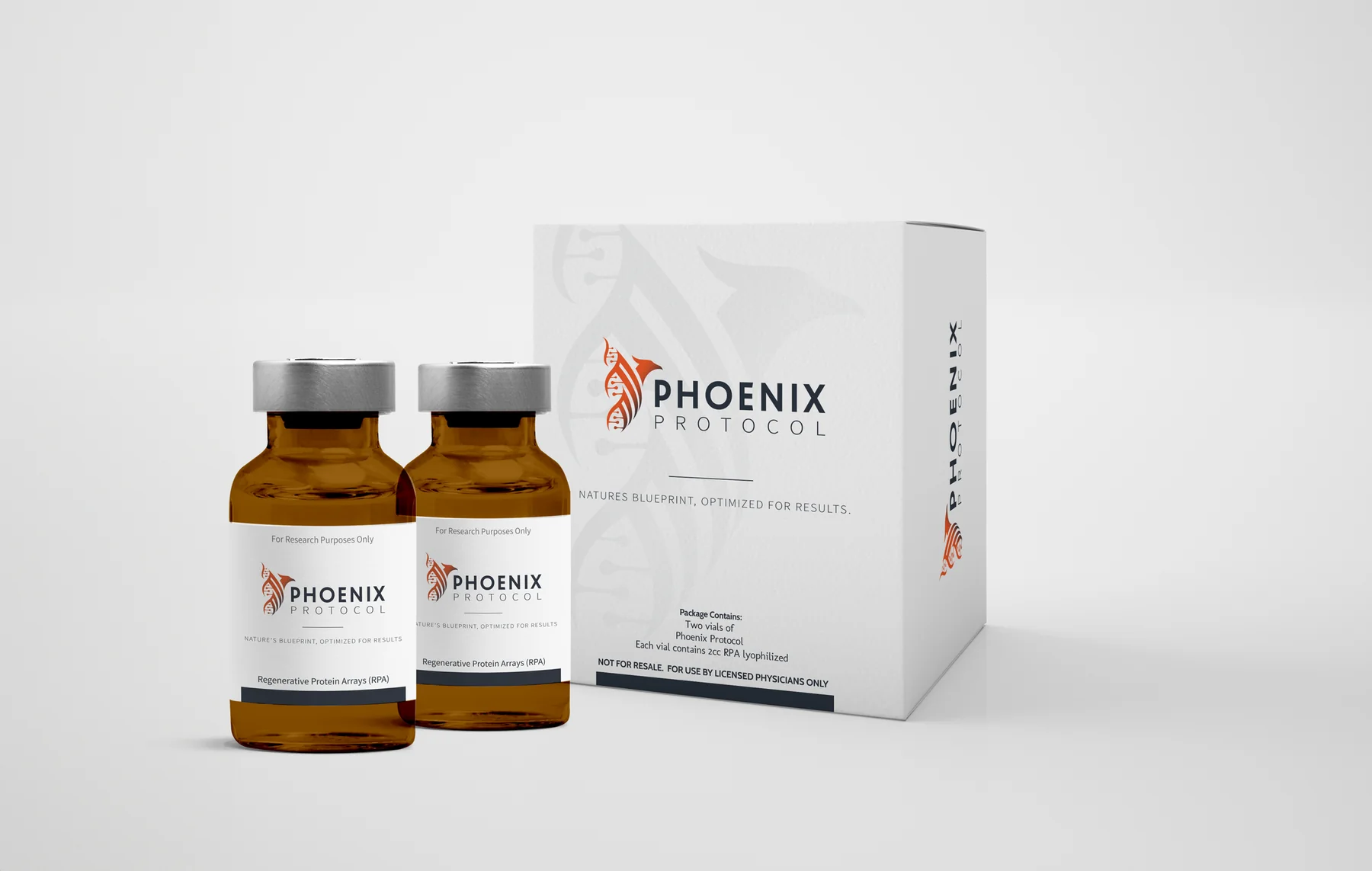
Regenerative Medicine & Life Sciences
R3Gen Health
A full identity system and packaging program for a regenerative medicine company, plus a dedicated product brand for their flagship Regenerative Protein Array therapy.
- Packaging and brand credibility shortened physician and partner sales conversations
- Phoenix Protocol launched as a distinct, premium-priced product brand
- Unified collateral let sales, clinical and marketing teams work from one asset library
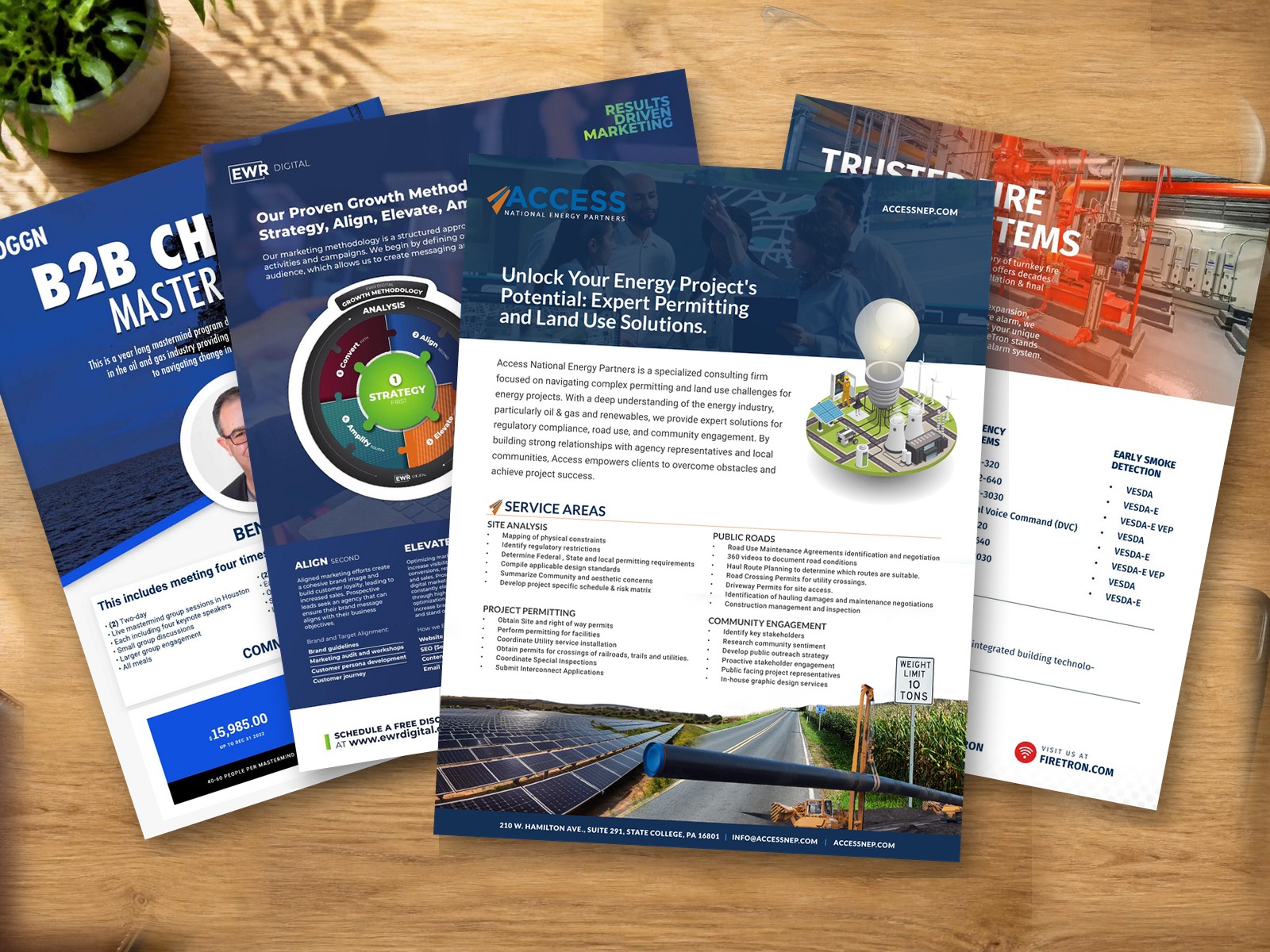
Collateral in the wild
One-pagers people actually hand out.
Sell sheets, one-pagers and brochures built from the same identity system as the logo, the site and the signage, so nothing looks borrowed from a different company.
See graphic design services →