
R3Gen Health
A full identity system and packaging program for a regenerative medicine company, plus a dedicated product brand for their flagship Regenerative Protein Array therapy.
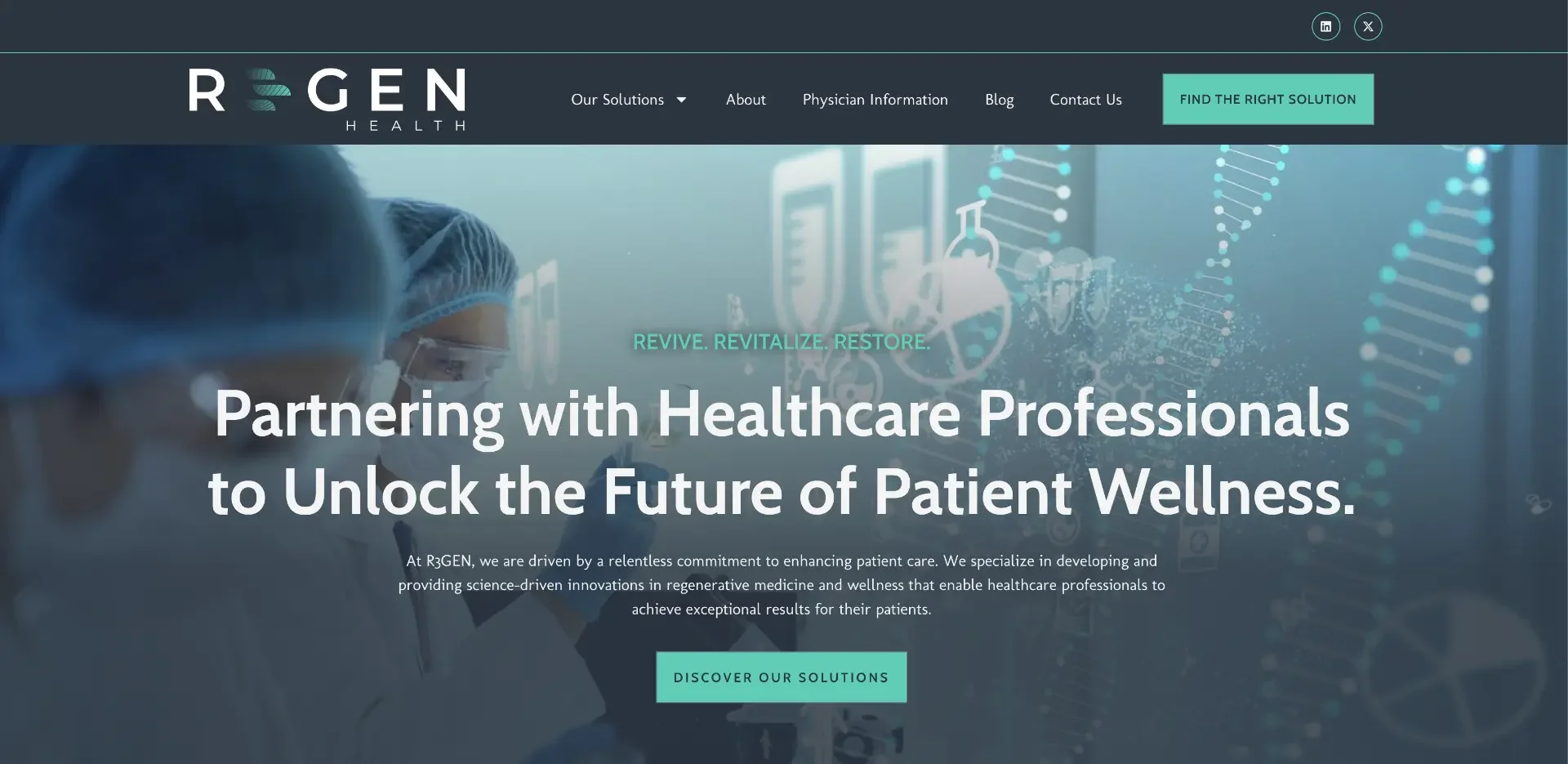
Challenge
R3Gen Health needed to look and feel as advanced as the science behind their work. Regenerative medicine buyers, physicians and research partners are skeptical by default, so the brand had to signal clinical credibility, innovation and trust at first glance, on everything from a business card to a labeled vial.
Approach
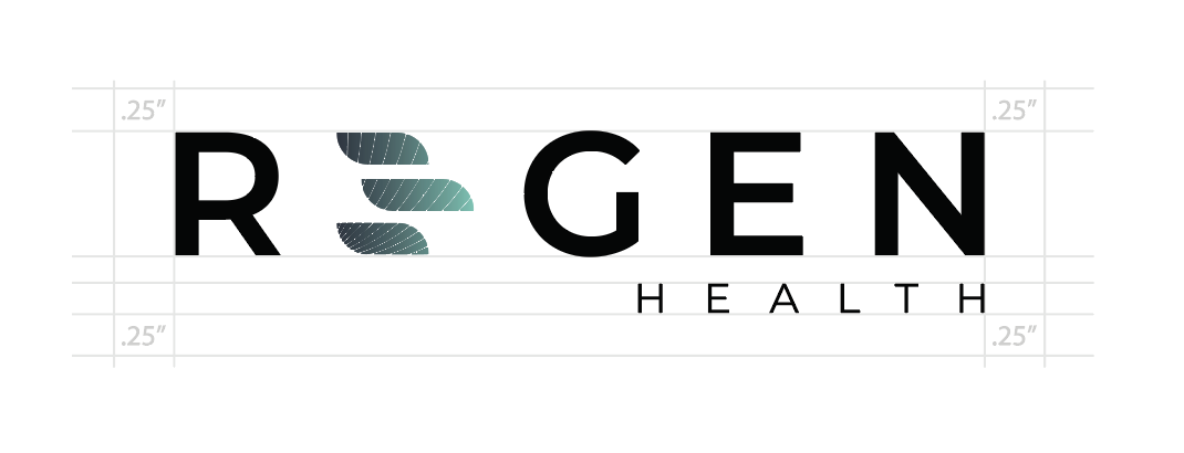
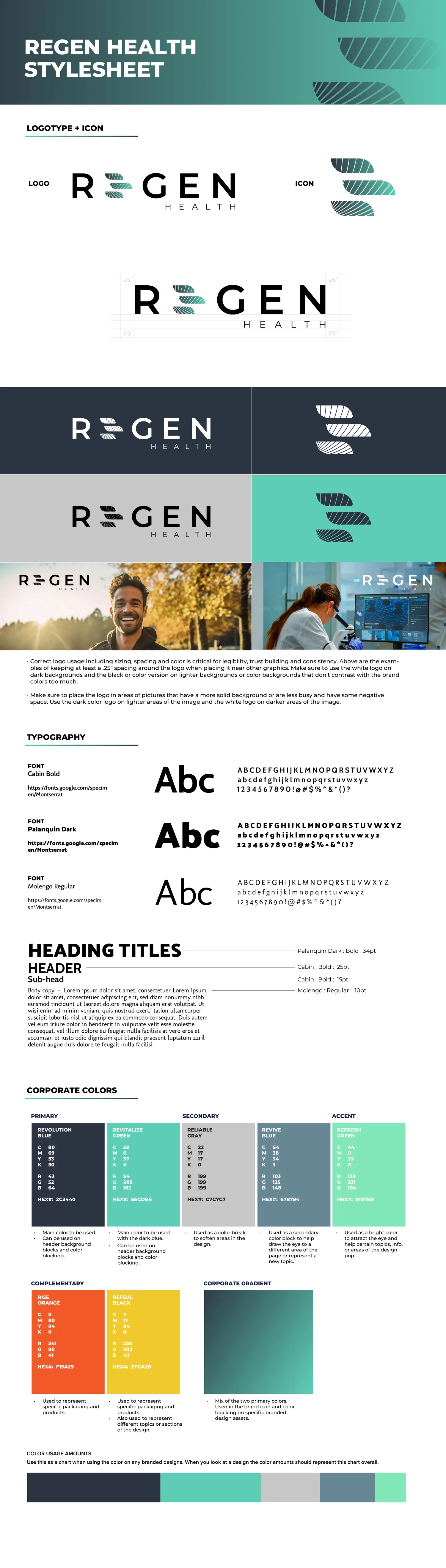
We built the R3Gen Health identity from the ground up: naming conventions, a custom logotype with an integrated DNA-inspired mark, an icon system, a full brand guideline and a color language of Revolution Blue, Revitalize Green, Reliable Gray and Refresh Green. Every rule was documented so the brand stays consistent across print, digital, environmental and packaging touchpoints.
Solution
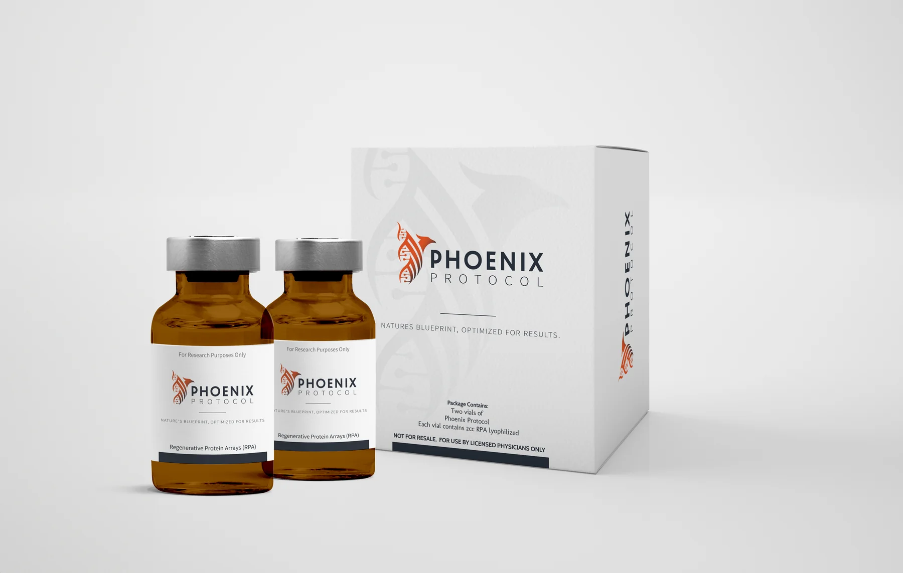
With the parent brand in place, we designed a distinct product identity for Phoenix Protocol, R3Gen Health's flagship Regenerative Protein Array therapy. The Phoenix mark, packaging system, vial labels and outer carton were engineered to meet clinical labeling standards while still feeling premium and unmistakable on a shelf, in a physician's office or in patient-facing communications.
Deliverables
- R3Gen Health logo & icon system
- Brand style guide
- Color & typography system
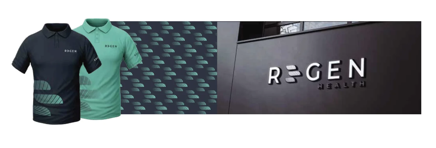
- Environmental signage & apparel
- Phoenix Protocol product brand
- Vial & carton packaging design
- Clinical & marketing collateral
Outcome
R3Gen Health launched with a cohesive parent brand and a sub-brand that reads as a serious clinical product, giving their sales, physician-facing and marketing teams a single, credible visual system to grow on.
Results
- Packaging and brand credibility shortened physician and partner sales conversations
- Phoenix Protocol launched as a distinct, premium-priced product brand
- Unified collateral let sales, clinical and marketing teams work from one asset library
- Investor- and partner-ready presentation materials produced from the same system
Color system
Typography
- TypefacePalanquin Dark
- TypefaceCabin
- TypefaceMolengo
Selected pieces

“The brand and packaging elevated us from a startup to a serious clinical player. Physicians and partners take us more seriously the moment they see it.”
Related case studies
YONG
A bold, dragon-led identity for a Korean fast-casual concept inside Finn Hall food hall in downtown Houston.
Glam Shores
Naming, identity, brand voice and website for a women-only luxury travel agency curating exclusive beach and resort getaways.
TopDog Fireworks & Halloween Madness
A full rebrand and campaign system for a 14-store Houston fireworks and Halloween retailer, tied to a 30% sales lift in year one.
Need help with a similar challenge?
Tell us where your brand is breaking down and we will tell you honestly what is worth doing first, in what order, and what it would take.
Not ready to talk yet? Take the free Brand Audit and see where your brand stands in about five minutes.