
Glam Shores
Naming, identity, brand voice and website for a women-only luxury travel agency curating exclusive beach and resort getaways.
Challenge
The founder had a clear vision, curated, women-only trips to the most extravagant beaches and resorts in the world, but no name, no identity and no home online. She needed a brand that felt inclusive and empowering to travel-minded women while still reading as unmistakably high-end, exotic and celebrity-caliber.
Approach
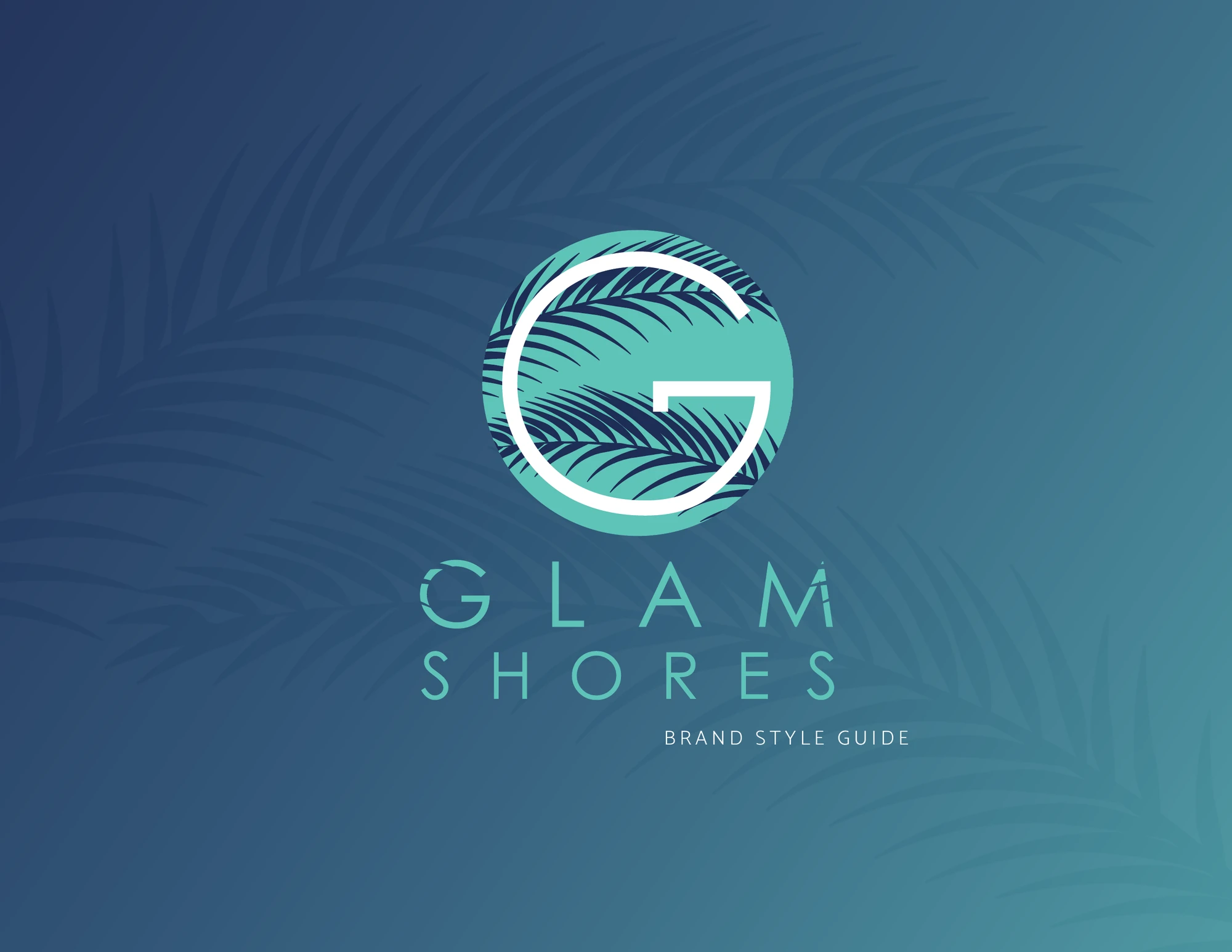
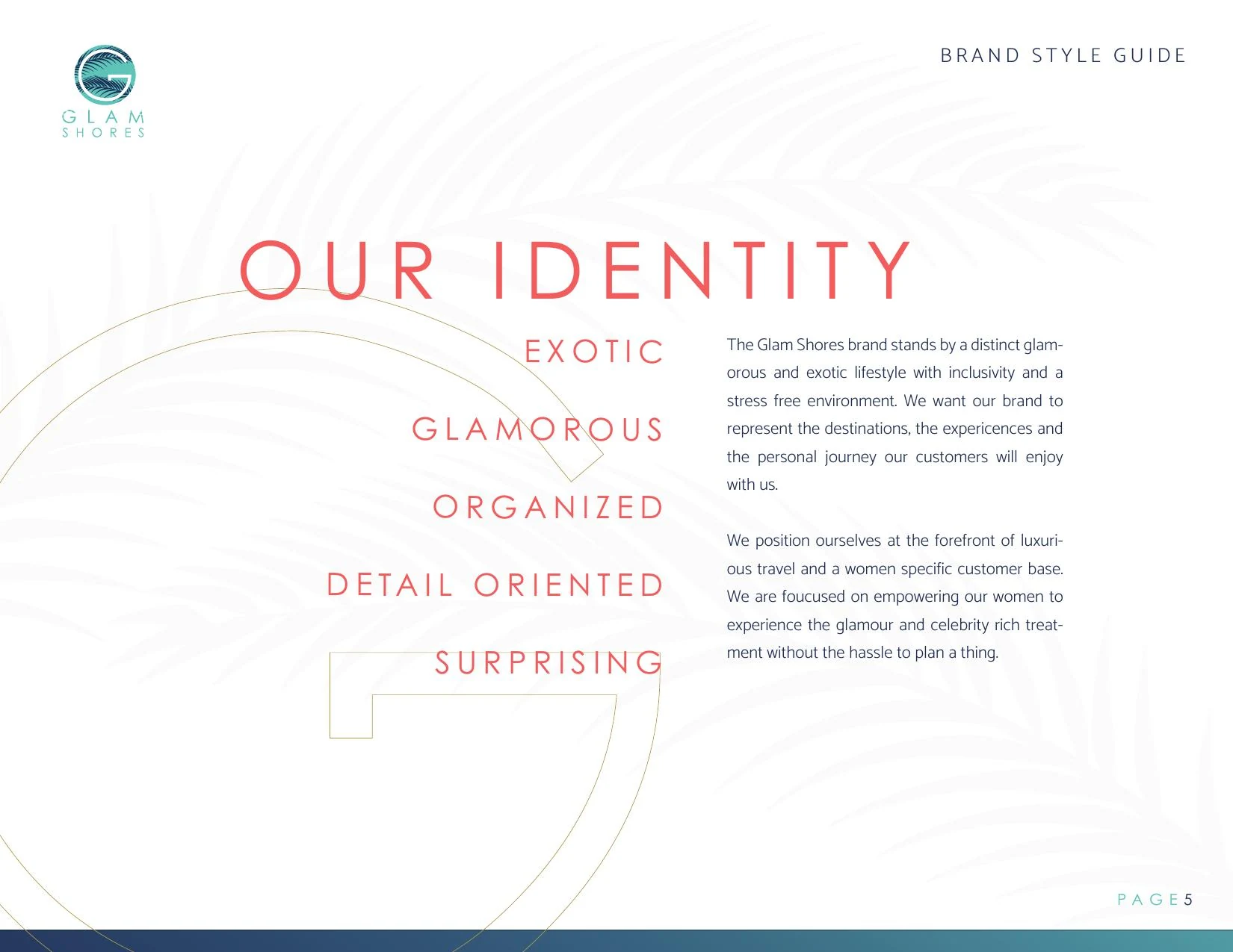
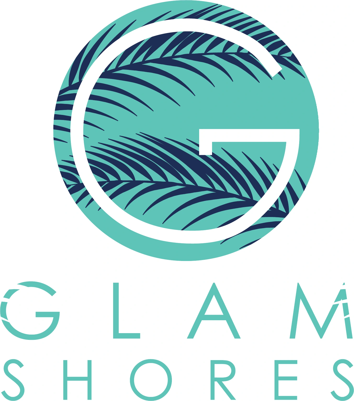
We started at the top of the stack: naming. After exploring dozens of directions we landed on Glam Shores, a name that captured both the glamour of the experience and the coastal, beach-resort setting. From there we defined the identity, voice, aesthetic and visual language, palm-shadowed monogram, coral, deep blue and sway aqua palette, Century Gothic display type, warm editorial photography, then built a marketing site to bring it all together.
Solution
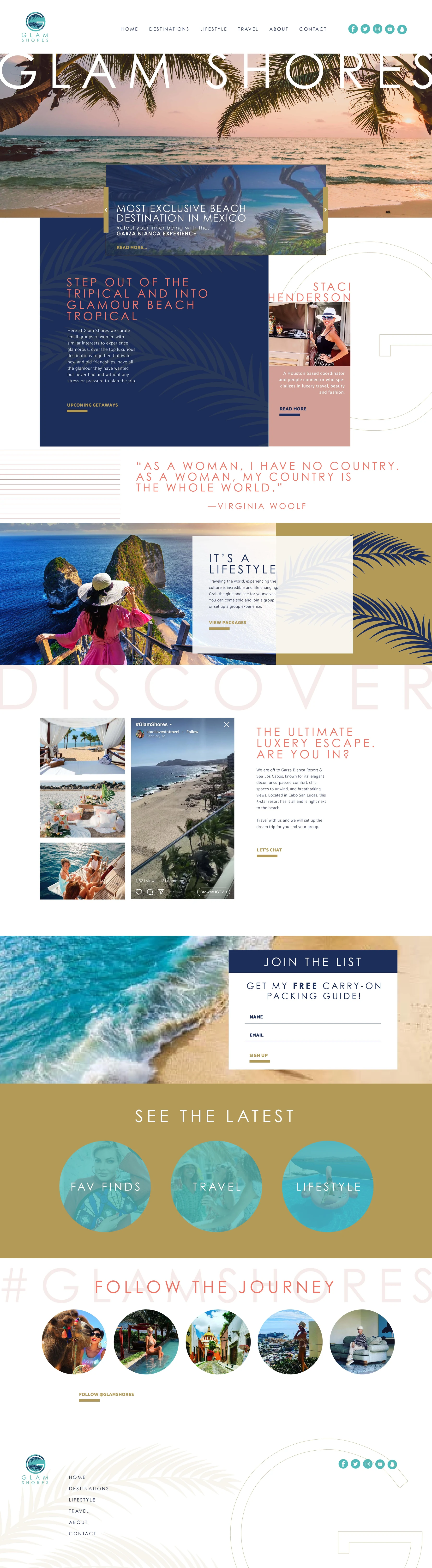
A full brand launch package: company name, primary and vertical logo lockups, standalone G icon, a documented brand style guide, and a marketing website designed to sell the fantasy first and the packages second, upcoming getaways, curator profile, lifestyle content, packages, journey follow and email capture.
Deliverables
- Company naming
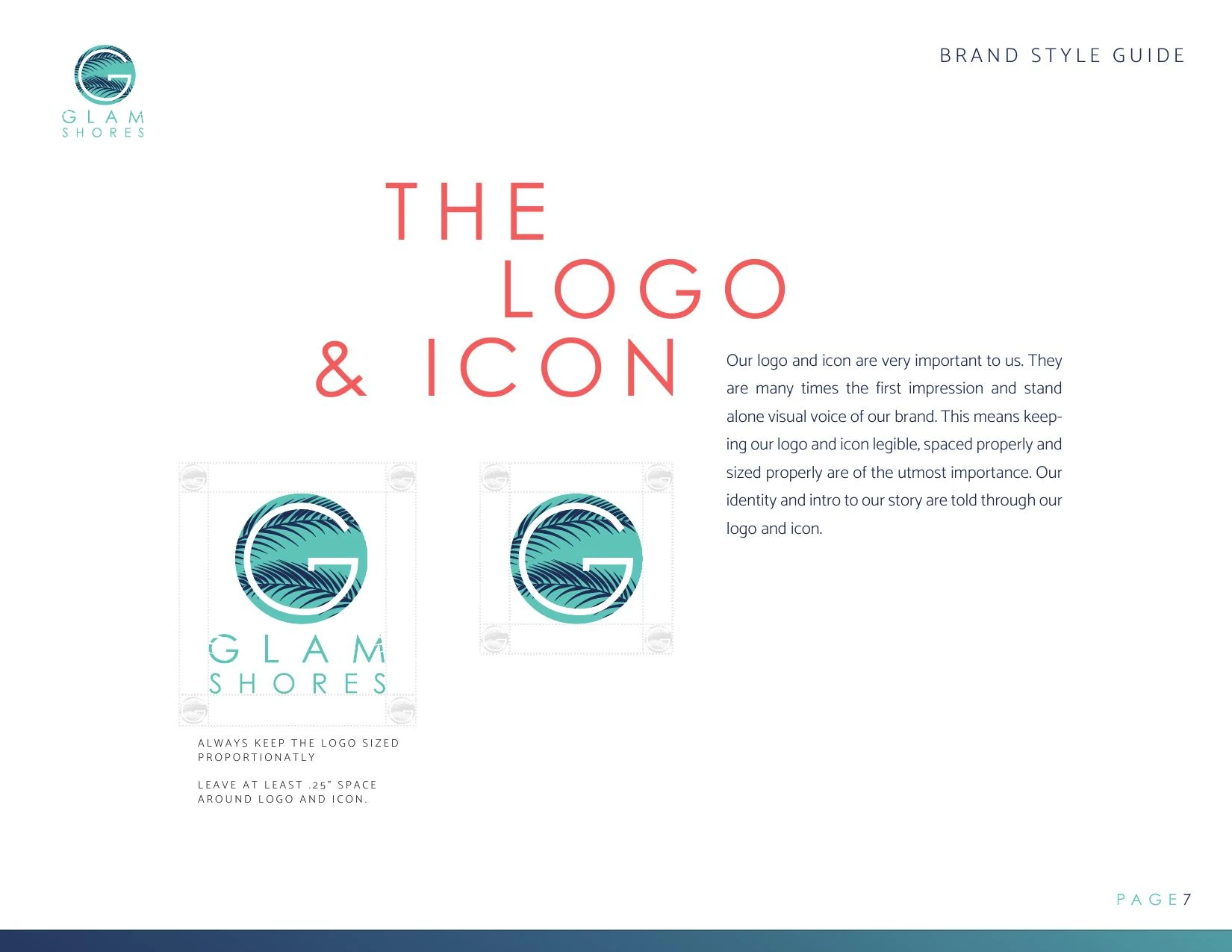
- Primary horizontal and vertical logo lockups
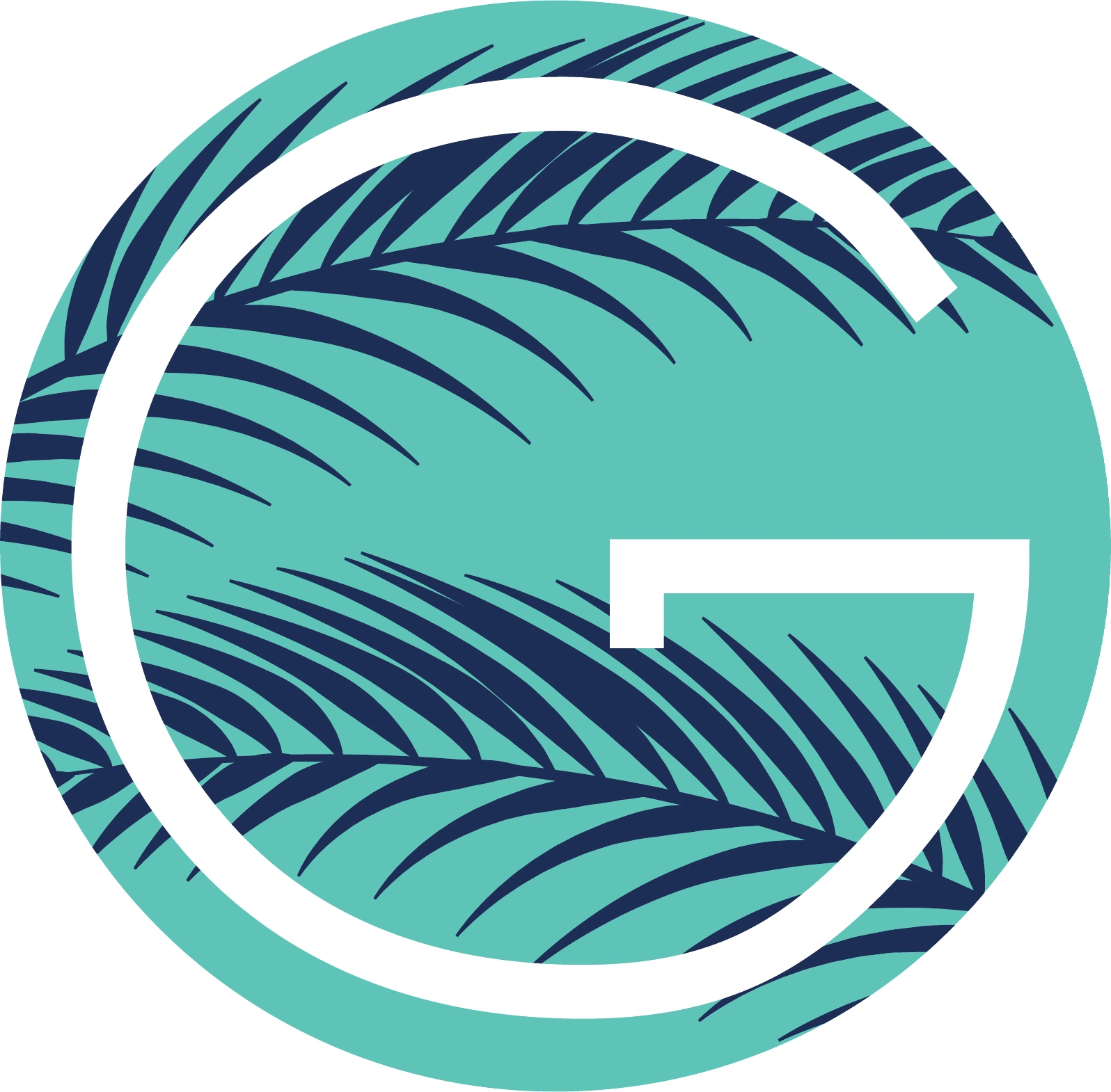
- Standalone G monogram icon
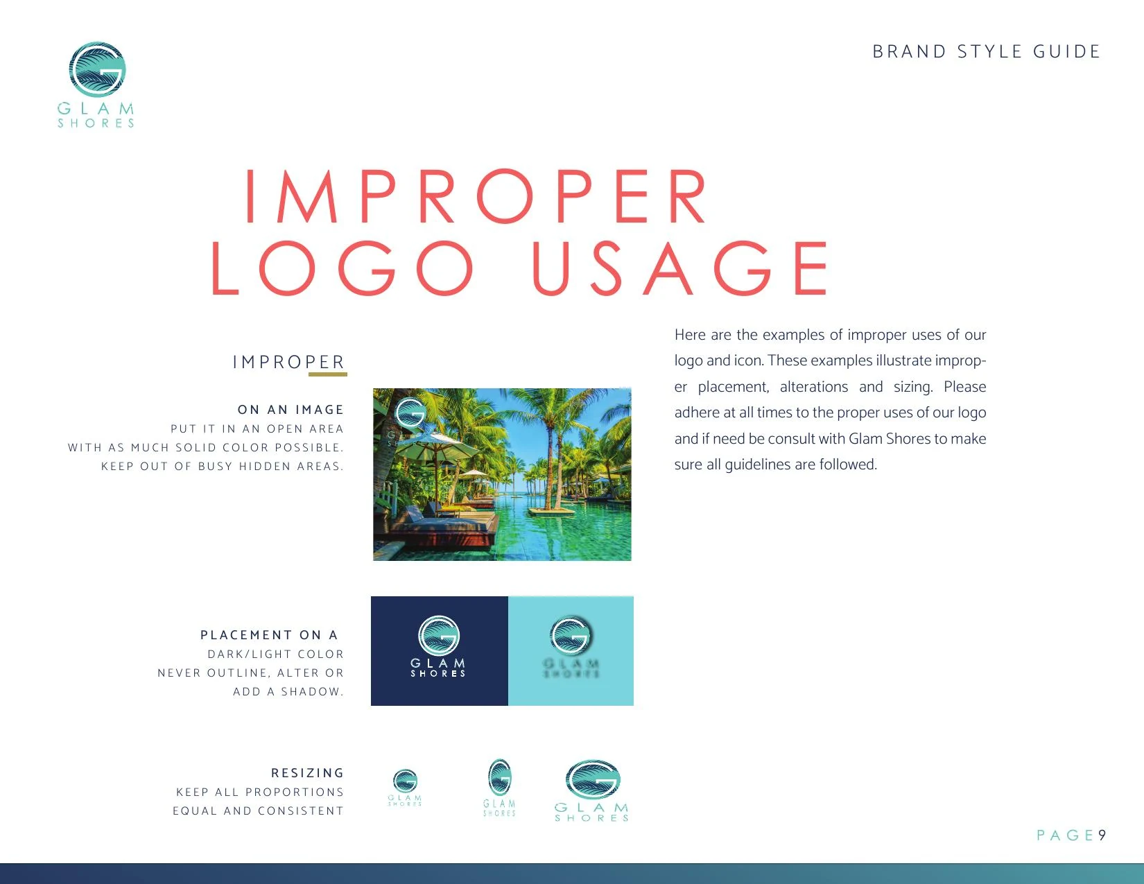
- Brand style guide (identity, logo usage, typography, color)
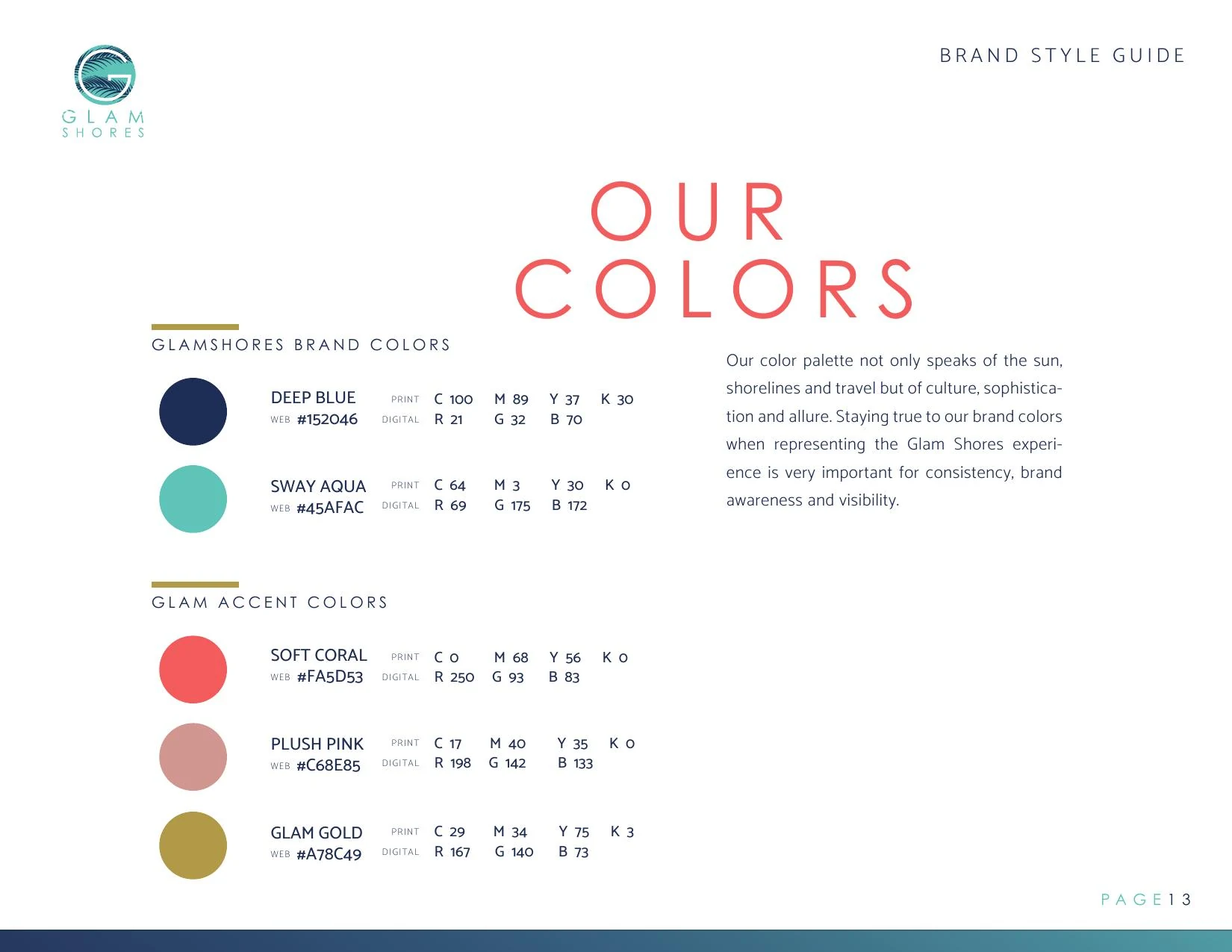
- Brand color palette (Deep Blue, Sway Aqua, Soft Coral, Plush Pink, Glam Gold)
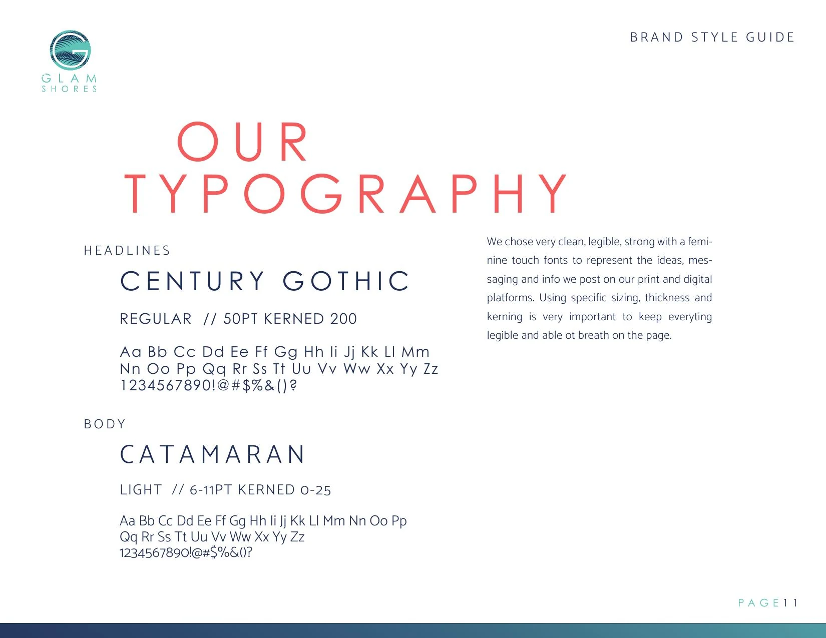
- Typography system (Century Gothic and Catamaran)
- Voice, messaging and brand personality standards
- Marketing website design
- Photography art direction
- Social media brand kit
Outcome
Glam Shores launched with a fully-formed identity, from name to homepage, and a brand system the founder can carry across trip guides, social, email and future offerings without losing the celebrity-caliber feel that sets the agency apart.
Results
- Launched a bookable brand from zero, name, identity and website, in a single engagement
- Premium positioning supported higher-ticket curated trip pricing from day one
- Consistent social and email kit reduced content production time for every campaign
- Brand system scales to new trip offerings without additional design spend
Color system
Typography
- TypefaceCentury Gothic
- TypefaceCatamaran
Selected pieces
Related services
Related case studies
YONG
A bold, dragon-led identity for a Korean fast-casual concept inside Finn Hall food hall in downtown Houston.
TopDog Fireworks & Halloween Madness
A full rebrand and campaign system for a 14-store Houston fireworks and Halloween retailer, tied to a 30% sales lift in year one.
Mountain View Regional Hospital
A full rebrand and multi-channel ad campaign that gave a physician-owned Wyoming hospital a recognizable, ownable brandstory across every patient touchpoint.
Relevant for
Need help with a similar challenge?
Tell us where your brand is breaking down and we will tell you honestly what is worth doing first, in what order, and what it would take.
Not ready to talk yet? Take the free Brand Audit and see where your brand stands in about five minutes.