
YONG
A bold, dragon-led identity for a Korean fast-casual concept inside Finn Hall food hall in downtown Houston.
Challenge
YONG needed a shelf-loud identity that could hold its own in a shared food hall next to a dozen other concepts, and translate cleanly from a backlit menu board to a business card to a paper takeout box.
Approach
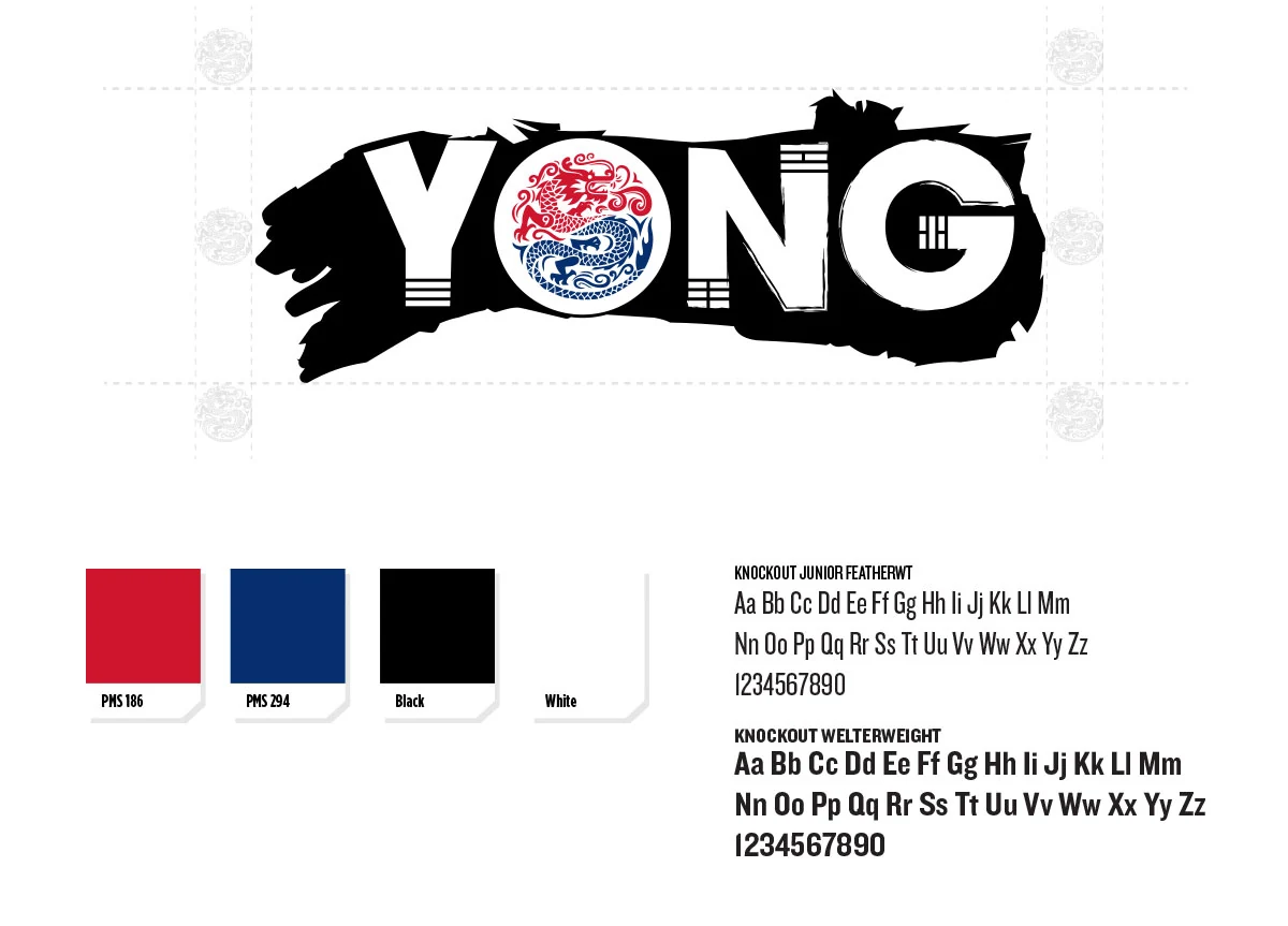
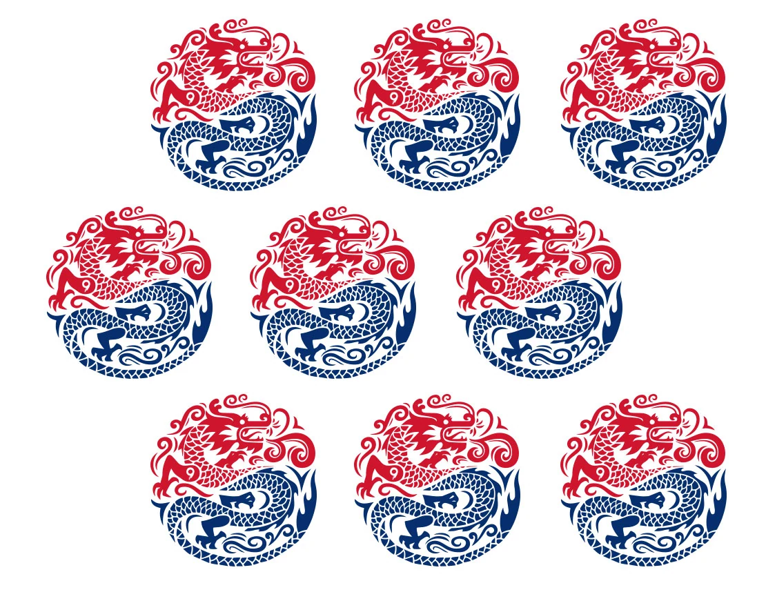
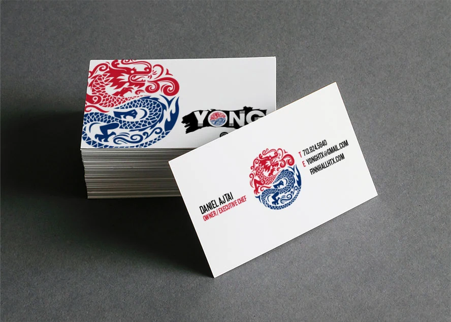
We anchored the mark on a single, ownable icon, an inked brush stroke with a dragon medallion set inside the O, then built a small, high-contrast system around it: two typefaces, four colors, and one repeating dragon pattern that runs across print, apparel and environmental graphics.
Solution
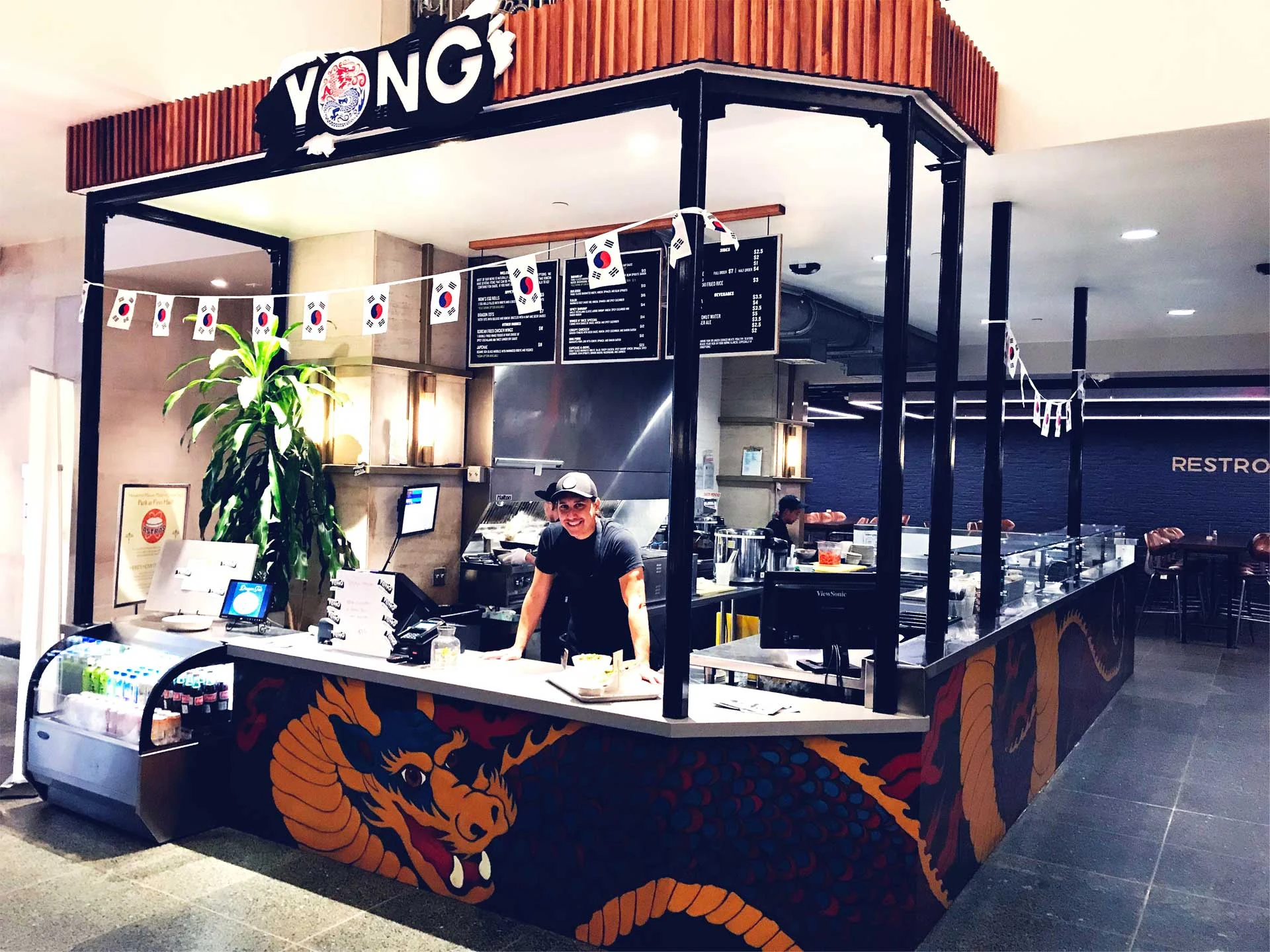
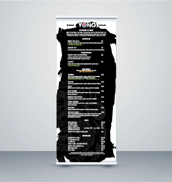
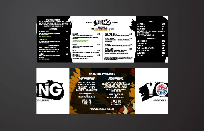
A confident wordmark, a red-and-blue dragon medallion, a modular print system covering menus, catering, business cards and retractable banners, environmental graphics wrapping the storefront counter, merchandise, and a marketing website tying online ordering, delivery and catering together in one place.
Deliverables
- Primary logo and dragon medallion
- Gatefold menu and catering print system
- Retractable banner and storefront signage
- Business card system
- Environmental graphics and counter wrap
- Branded apparel and merchandise
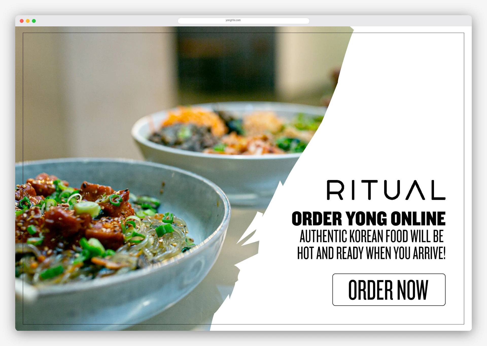
- Marketing website with online ordering
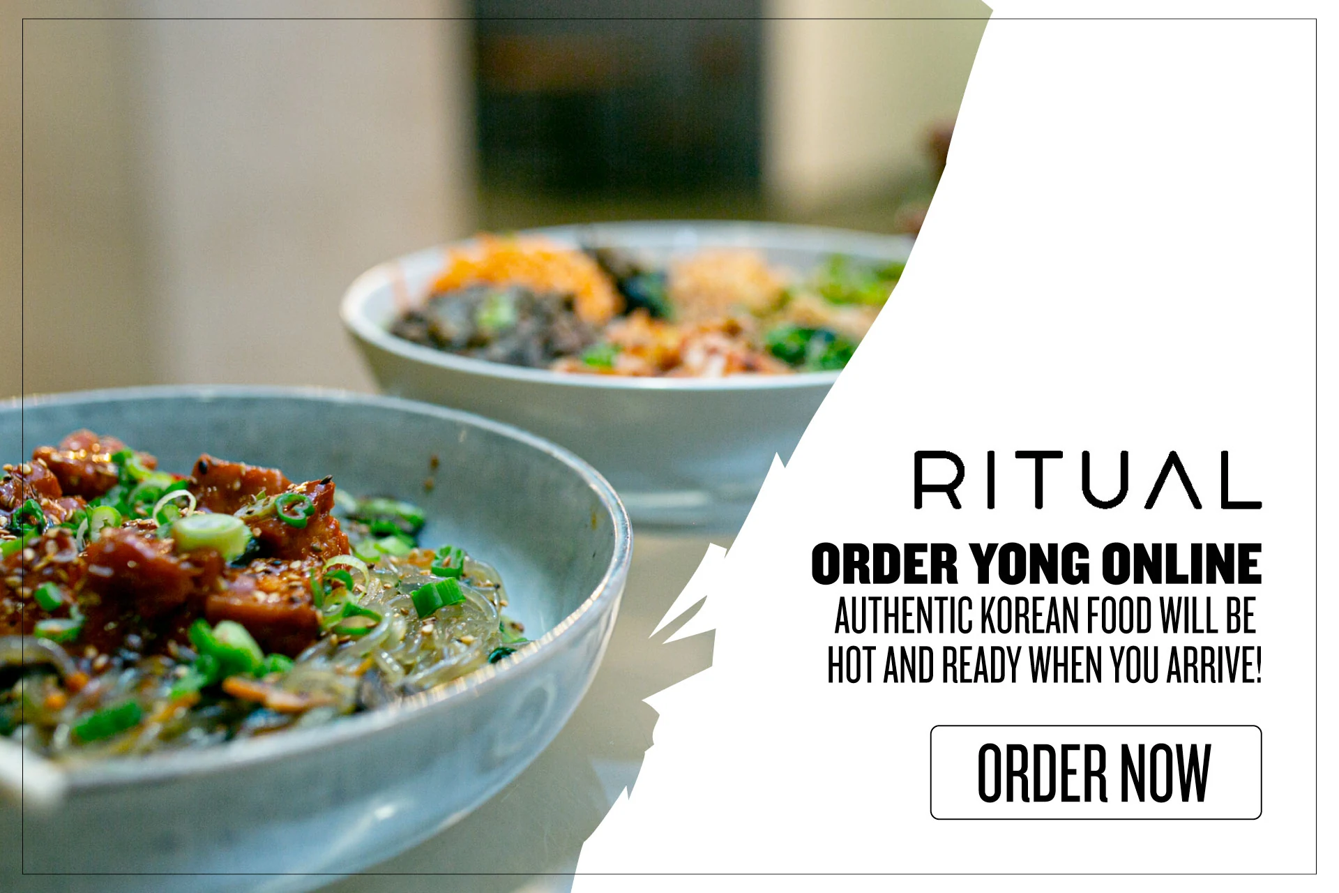
- Third-party delivery marketing (Ritual, Uber Eats)
- Brand color, type and pattern standards
Outcome
YONG opened with a coherent identity from storefront to receipt, and the medallion has since become the concept's most recognizable asset inside Finn Hall.
Results
- Opened to full-capacity traffic in Finn Hall with the highest brand recall of any stall in the hall
- Online ordering and delivery channels launched day one, adding a second revenue stream beyond walk-up
- Catering inquiries generated directly from the new print and banner system
- One reusable brand kit cut per-campaign design cost for every new menu and promo
Color system
Typography
- TypefaceKnockout Junior Featherweight
- TypefaceKnockout Welterweight
Selected pieces
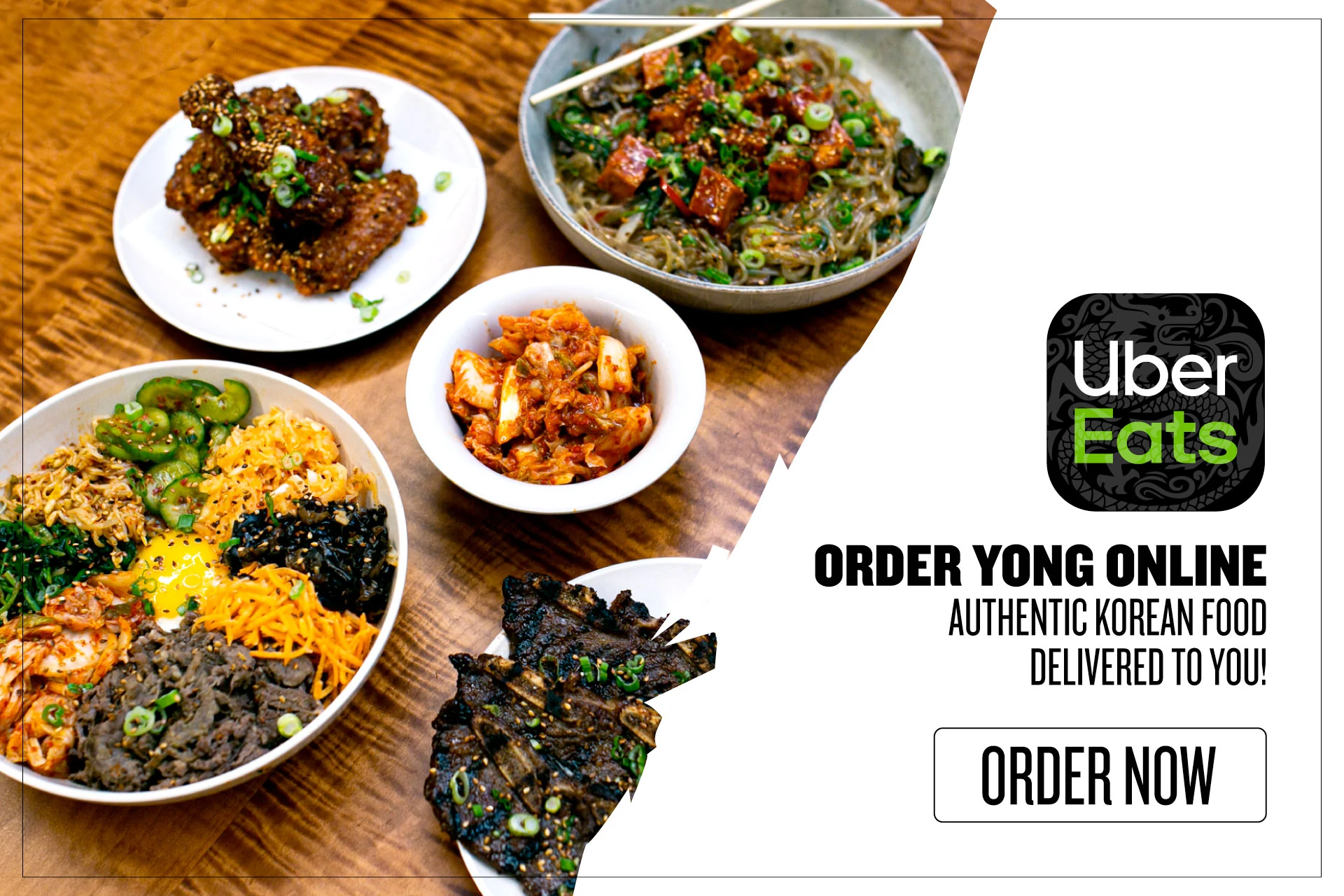
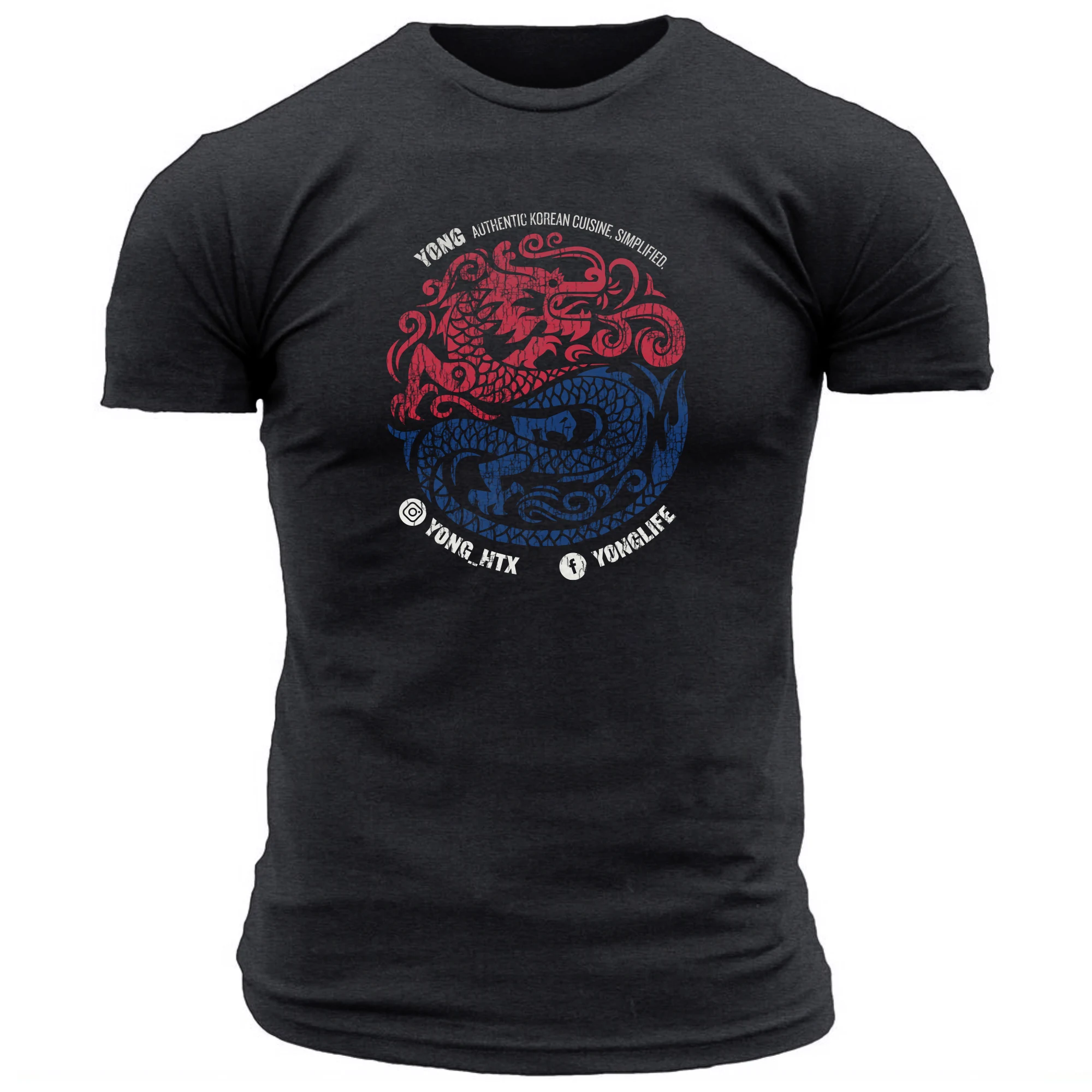
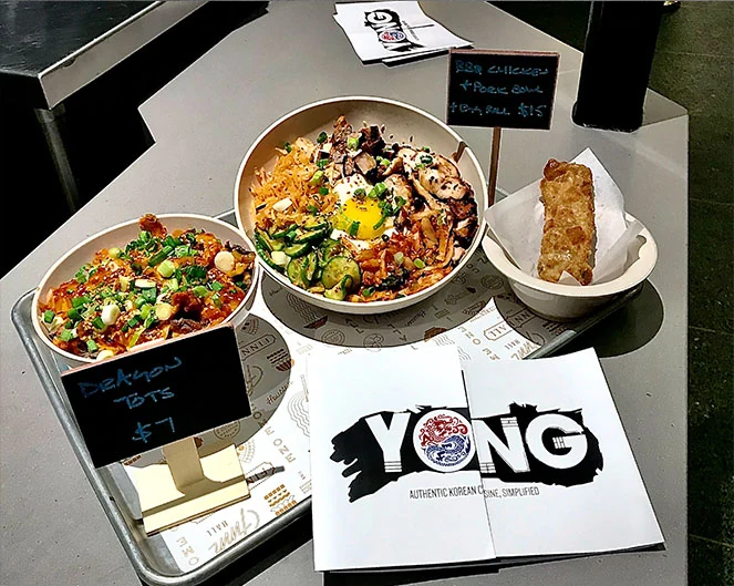
“Mike gave YONG a look that actually fights for attention in a food hall. Every piece feels like it belongs.”
Related case studies
Glam Shores
Naming, identity, brand voice and website for a women-only luxury travel agency curating exclusive beach and resort getaways.
TopDog Fireworks & Halloween Madness
A full rebrand and campaign system for a 14-store Houston fireworks and Halloween retailer, tied to a 30% sales lift in year one.
Mountain View Regional Hospital
A full rebrand and multi-channel ad campaign that gave a physician-owned Wyoming hospital a recognizable, ownable brandstory across every patient touchpoint.
Relevant for
Need help with a similar challenge?
Tell us where your brand is breaking down and we will tell you honestly what is worth doing first, in what order, and what it would take.
Not ready to talk yet? Take the free Brand Audit and see where your brand stands in about five minutes.